What a vertical video actually is
A vertical video is footage whose frame is taller than it is wide. The convention most short-form platforms build around is 9:16, the shape of a phone screen in portrait — for example 1080 by 1920 pixels. Two neighbours matter here: 4:5 is slightly taller than square and shows up in standard social feeds, and 16:9 is the familiar horizontal television frame at 1920 by 1080. All three can carry the same story, but they give you very different room to tell it.
Three differences drive almost every other decision.
How the frame is watched. A portrait frame is normally watched on a phone held in one hand, often in short bursts, sometimes with sound off. That viewing distance is short and the frame is close to the face, so small gestures and eye contact read clearly, while fine detail in a wide background disappears.
How much information fits. A tall frame carries less horizontal information than a wide one. Wide scenes, side-by-side comparisons, and landscapes lose meaning because there is nowhere to put the width. What a tall frame does well is stack information: subject on top, action in the middle, text underneath, each element sharing the same column instead of competing for width.
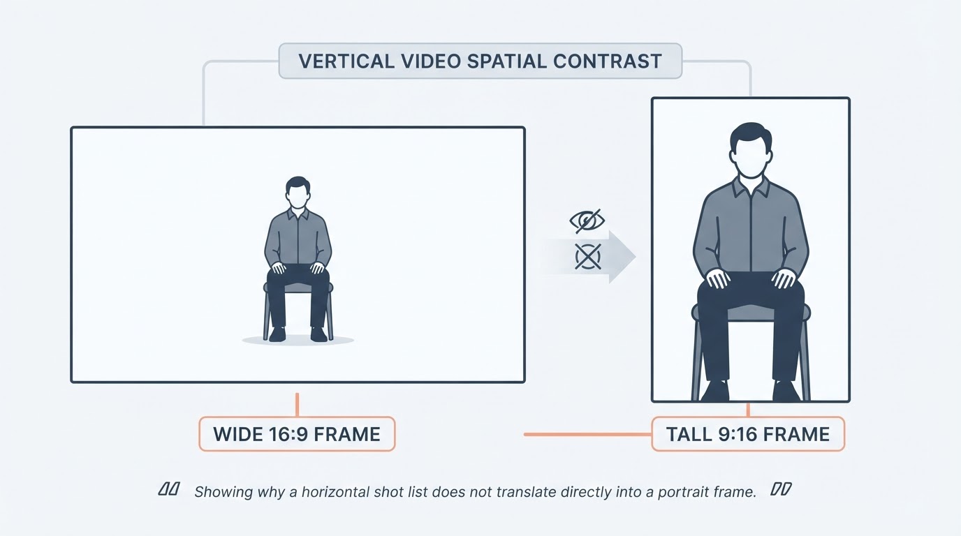
How much pressure lands on composition. Because the frame is narrow, a single subject fills a larger share of it. Backgrounds compress, and any mistake in headroom, subject placement, or text position becomes obvious fast. Horizontal frames forgive a loose composition; a portrait frame usually does not.
Where the portrait frame earns its keep
Vertical suits content built around a person, a single object, or one action at a time.
- Person-forward content. A face-to-camera segment, a talking explanation, a reaction. The narrow frame crops naturally to shoulders and head, so the viewer stays close to the speaker without a distracting environment.
- Step-by-step tutorials. One step per shot works well, because a tall frame shows a hand, a tool, and the result in a vertical stack that reads top to bottom in the same order the viewer performs it.
- Short narrative beats. A hook, a beat, a payoff. Each shot carries one idea, and the tall frame keeps attention on the change rather than the surroundings.
- Product or object close-ups. Something held in hand, lifted toward the camera, or turned to show a detail. The narrow frame makes the object fill the screen at a distance where a horizontal shot would show mostly table.
- Movement along the vertical axis. Pouring, stacking, unboxing, rising, falling, before-and-after transitions. Actions that move up or down the frame gain energy in portrait.

It suits them less well when meaning depends on width: a wide landscape, a group standing shoulder to shoulder, choreography that needs the full lineup, a two-person conversation filmed side by side, or a screen recording of a desktop interface. You can still shoot these vertically, but you generally end up either cutting out the information the shot existed for, or compressing it until it is unreadable on a phone.
Placing the subject in a tall frame
Most vertical framing problems come from copying a horizontal shot list straight into a portrait frame. Four habits fix most of it.
Keep the eyes in the upper third. Place the subject's eye line roughly a third of the way down from the top of the frame. Dead centre leaves dead space above the head and pushes the body out of the bottom, which reads as an accident rather than a choice.
Cut the headroom down. In a 9:16 frame, a large gap above the head is wasted area. A small margin — roughly a hand's width — is usually enough, and it leaves more of the frame for face, hands, and gesture, which is where a phone viewer is actually looking.
Use the tall axis for depth. Put a foreground element low in the frame, the subject in the middle, and something that gives context high in the frame. A tall frame reads as a stack of planes, so a shot that has foreground, subject, and background at different heights feels deep rather than empty.
Leave room in the direction of travel or gaze. If the subject walks left, give more space on the left. If they look up, give more space above. In a narrow frame, that gap is the difference between a subject who has somewhere to go and one who looks pinned against the edge.
For a single talking subject, a slight offset from the centre line — toward the side they face — is usually steadier than perfect symmetry, because it opens up the empty side for captions later.
Safe zones, captions, and mobile readability
Platform interfaces draw on top of your video. Captions, usernames, action buttons, and progress bars sit inside the same rectangle as your shot, and they move between surfaces: a feed, a story, a reel, and a shorts player do not reserve the same areas. Rather than memorise numbers, treat three bands as fragile and check them per platform before publishing.
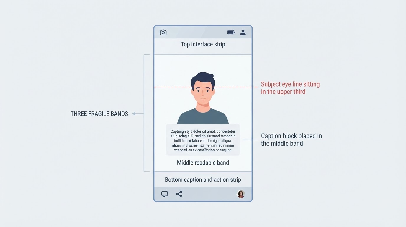
- The bottom band carries the caption text, the account name, the action row, and often a progress bar. Keep faces, products, hands, and any meaning-critical text above it.
- The right edge carries a vertical stack of interaction icons on several platforms. Keep logos, prices, and small labels clear of it.
- The top edge carries navigation, a title, or search. It is a bad home for a headline.
Inside the safe area, captions deserve their own planning. One to three short lines set large, in a heavy weight, with strong contrast, and positioned in the middle band of the frame will be readable in sunlight, at arm's length, on a phone that is being held one-handed on a bus. A full sentence at small size will not be. If a caption must sit over moving footage, give it a flat or softly darkened backing rather than letting it fight a busy background. And if the text carries the meaning — a step number, a warning, a price — do not rely on the platform's automatic captions to deliver it.
When horizontal is the better choice
Vertical is a delivery format, not a quality mark. Choose 16:9 when the content's meaning lives in width: wide environments, groups, sports and dance, side-by-side comparisons, desktop screen recordings, long-form interviews, or anything destined for a television or a laptop where the viewer is sitting back. If most of the audience watches on a larger screen, a portrait frame simply gets smaller.
A practical middle path is to plan the frame at capture time rather than at delivery time. If a shoot has to serve both, keep the important action inside a centred area that would survive a vertical crop, and decide the final frame before you record — not after. This is a planning decision, not a conversion step: turning an already-finished horizontal video into a vertical one is a separate job with its own losses in resolution and framing.
A five-minute check before you publish
Platform specifications change, so verify rather than assume. Five checks catch most of the expensive mistakes.
- Confirm the destination's current ratio and resolution from that platform's own published upload guidance, not from a blog post written two years ago.
- Confirm what the file actually is. Check the real pixel dimensions and the rotation flag, and make sure the file does not merely look vertical because a player is displaying it that way.
- Confirm the safe areas on the exact surface you are posting to. Feed, story, reel, and shorts treatments differ, and interface elements move between app versions.
- Check the edges in a real phone preview. Upload as a draft where possible and look at what the crop does to the top and bottom, and to any text near the border.
- Check text at arm's length, outdoors if you can. If the caption is not legible in a two-second glance, it is decoration rather than information.
If you generate the video instead of shooting it
Generation tools decide a lot of the framing for you, and the ratio is one of those decisions. Confirm it before you generate rather than after, because a crop applied later costs resolution and undoes the composition you planned.
Ask four questions before the first render: what aspect ratio does the tool output by default, can it be set explicitly, what pixel dimensions does it actually produce, and is the frame genuinely composed for a tall format or is a wide image letterboxed inside a vertical container. A letterboxed output is easy to spot — look for flat bars above and below the picture — and it usually means the subject was composed for width and will look small on a phone. Also check where the tool places text, since generator-applied captions rarely respect platform interface zones.
If the answers are unclear, treat the tool as unverified and test with one short clip before committing a full project to it. The same discipline applies to the reference you might be working from: a reference video's framing tells you how that creator solved the problem, not that the same framing will work for your subject.
The short version
Vertical video is a tall frame that rewards a single, close, vertical subject and punishes a shot list borrowed from horizontal footage. Put the eyes in the upper third, cut the headroom, stack the frame in depth, keep faces and text out of the interface bands, and confirm both the ratio and the safe areas on the platform you are actually publishing to. When the story needs width, shoot horizontal without apology — and decide the frame before you record or generate, not after.