Realism is a pattern of imperfections, not a resolution setting
When someone asks for a realistic video, they usually mean something narrower than they say: the clip should look like footage recorded by a person holding a camera in an actual room, not like an image rendered by a machine. Sharpness, frame rate and colour depth do not create that impression. The tells that break it are almost always structural, and they are decided before a single frame is generated.
Four levers produce most of the effect. Each one is a decision you can make in advance, and each one has a matching mistake that makes a clip look synthetic even when the render is technically clean.
Lever | What it changes on screen | Common mistake |
|---|---|---|
Capture medium | Lens feel, grain, contrast, motion blur, colour drift | Choosing a look word ("cinematic") instead of a device |
Light direction | Where shadows fall, how fast the room darkens | Even, source-less light that flatters but reads as a render |
Camera motion | Whether the frame feels carried by a body or a crane | Combining moves no operator could perform at once |
Scene detail | Whether the room looks owned and used | Perfectly clean surfaces, symmetrical clutter |
Treat the table as the order of work, not a menu. A clip that gets the medium and the light right but fills the frame with gift-shop objects will still fail, and no amount of extra detail rescues footage whose light comes from nowhere.
Decide the capture medium before anything else
Realism starts with a simple question: what device recorded this? A phone in someone's hand, a 1990s camcorder tape, a 16mm camera, a locked-off digital cinema body - each carries a bundle of expectations that viewers recognise instantly, even when they cannot name them.
Phone footage tends to have a wide lens with deep focus, mild hand shake, clipped highlights near windows, and colours that look slightly over-saturated in daylight. Home-video tape looks softer at the edges, drifts in colour, and often shows a date stamp or tracking lines. Film has grain that moves between frames rather than sitting still, and a faint gate weave.
The point of naming the medium is consistency. Once you say "phone in a kitchen", every other parameter has to agree with it: the focal length feel, the amount of shake, the contrast curve, the grain. A clip with film grain over perfectly smooth gimbal motion reads as uncanny because the two signals contradict each other.
Write the answer down as a sentence before you generate anything, for example: "Shot on a phone held at chest height in a small kitchen at about 4pm in winter." That sentence is doing more work for realism than any style adjective.
Set one light direction and defend it
Pick the source first, then check that every shot obeys it. A window camera-left, one practical lamp behind the subject, flat overcast sky, a wall bounce - the specific choice matters less than the fact that there is a single answer.
Three checks catch most lighting failures:
- Falloff. Does the brightness drop as you move away from the source? A room lit evenly from every direction has no falloff, and no falloff is the strongest render signature there is.
- Shadow side. Do shadows land on the same side in all shots of the same scene? They should, unless something in the story changes the light.
- Colour temperature. Does the light colour match the stated time of day and the room's lamps? Mixed sources are fine and often convincing, but the mix has to be consistent.
If you only fix one thing in a clip that looks fake, fix this. Viewers forgive soft edges and odd props far more readily than they forgive light that has no origin.
Use camera motion a body could actually perform
Decide whether the camera is handheld, on a tripod, or being carried, and then stay inside the vocabulary of that choice. Handheld means a slow sway, occasional small corrections, and a slight drift in the horizon. Tripod means the frame is stable and any movement is a controlled pan or push. Carried means footsteps show up as rhythm in the vertical axis.
The failures cluster in combination moves: a push that also orbits, a crane that also pans, a walk that also zooms. A person cannot do those at once with a phone, so the eye files the shot as generated even when it cannot say why. If the story needs more energy, change the shot, not the move.
Fill the frame with ordinary, used detail
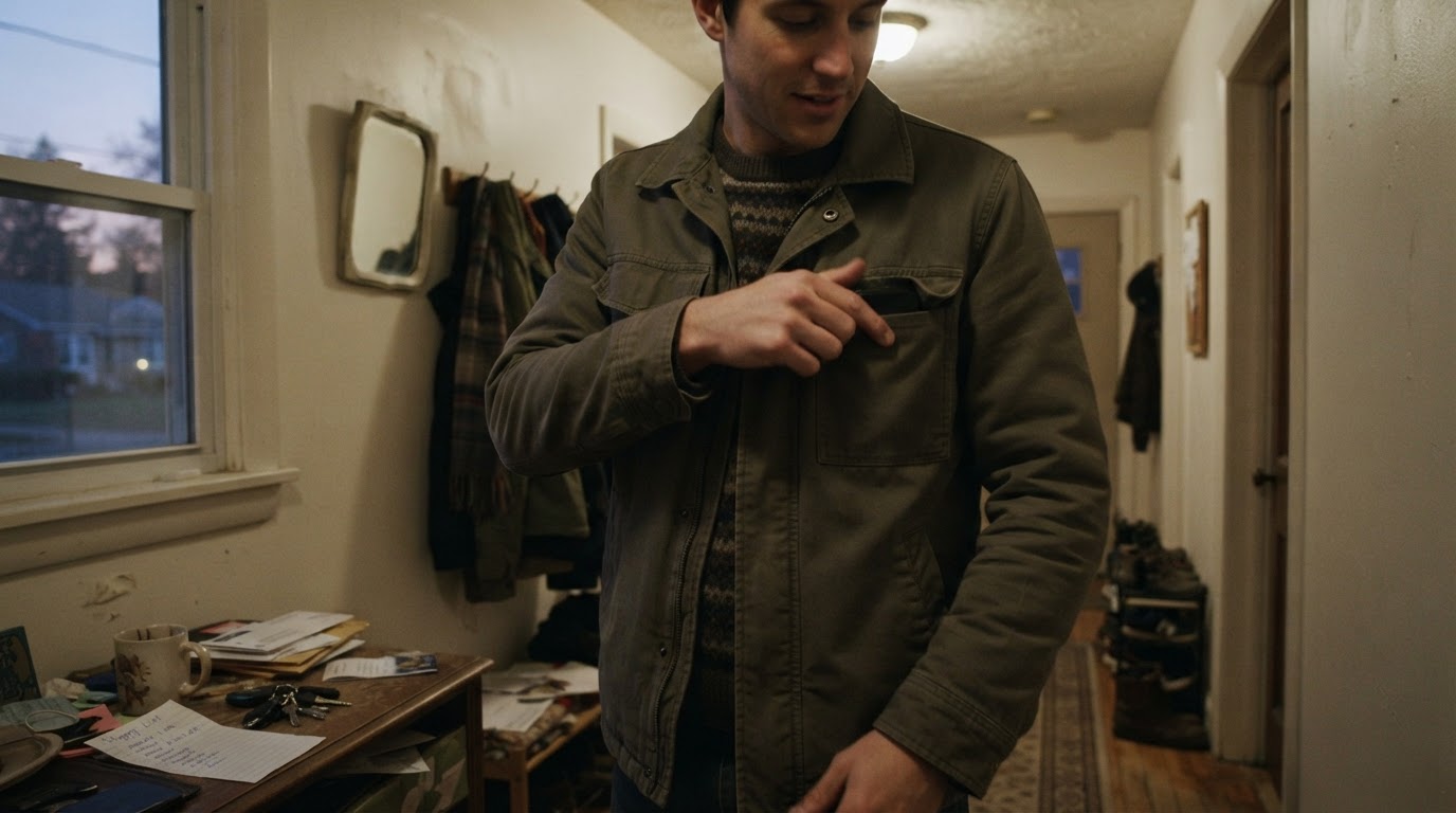
Real rooms are asymmetrically cluttered. Real clothes crease at the joints, not in tidy folds. Real tables have rings, cables, unopened post. Add two or three specific ordinary objects per scene and let the background be unevenly busy.
Detail has a ceiling. Uniform grime, evenly scattered props and a background that is "artfully messy" all read as designed. The target is not more objects, it is objects that suggest a specific person lives there: a shopping list in one handwriting, a mug left on its side, a chair pushed back at an angle. Each shot should show one action a real person would perform, in a room that looks lived in.
Build the story from actions, not from the reference frames
A reference clip is worth studying for one thing: structure. Its opening, its shot order, its pacing, the moment it pays off. Those are craft decisions you can learn from and rebuild with your own material. The frames themselves, the voices and the music are someone else's work, and finding a reference grants no rights to reuse any of it.
Write the story as a sequence of believable actions, one per beat. A usable example, using a five-beat scene about someone leaving for a night shift:
- A hand pats a jacket pocket twice and finds nothing.
- The person crosses to a hallway table and lifts keys out of a bowl.
- The keys catch on a lanyard; the person untangles them without looking down.
- The person stops at the doorway and looks back at a lit kitchen.
- The door closes; the kitchen light goes out a second later.
Every beat is an action with a physical consequence, and none of them requires copying another creator's shot. Each shot either shows a new piece of information or advances an action; if a shot does neither, cut it. This is also the cheapest place to fix a boring clip, because rewriting a beat costs nothing while regenerating one costs points.
Confirm the style you want is actually available
Named visual styles are convenient, but availability is configuration-dependent. Before committing a story to a look, check that the workspace you are working in offers it, and preview on the shortest, least important shot rather than the key moment. Prefer a style whose preview shows the exact texture you want - grain size, softness, colour cast - over one whose name sounds closer to your intent.
Two limits are worth knowing in advance. Styles are usually saved and reusable across videos, which helps a series stay coherent, but reusing a style does not guarantee identical characters or voices across outputs. Consistency between clips is something you still have to manage shot by shot.
Review the finished clip with the same checklist every time
Review the clip in this order: people, actions, sound, environment, then small unnatural details. Watching in a fixed order stops you from being distracted by whichever flaw happens to be most obvious.
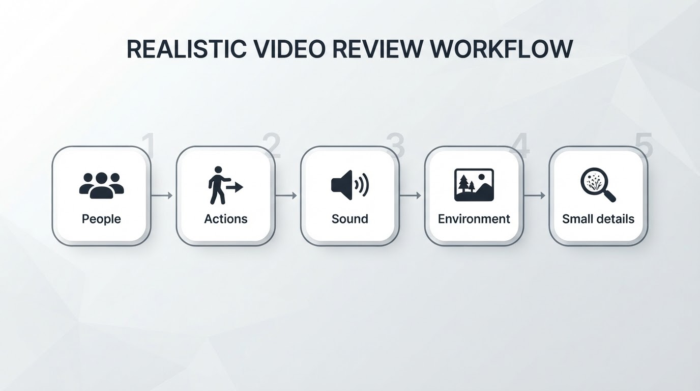
- People. Hands, finger count, teeth, eyes and gaze direction, limb count in motion, the way hair meets a collar, whether a face changes between shots.
- Actions. Weight and contact: does a foot land on the floor or pass through it, does a hand actually grip the object, does a person keep walking in the same direction across a cut.
- Sound. Sync on impacts, room tone that matches the space, voices that belong to the faces, silence where a real room would hum.
- Environment. Background continuity, reflections that show the right room, text that reads as text, doors and windows in the same place after a cut.
- Small unnatural details. Edges that warp near the frame border, textures that shift between frames, background people who stand perfectly still, fabric that moves without wind.
Set a completion standard before you start reviewing, or the review will drift: the clip passes when all five checks clear on one uninterrupted viewing, and again frame by frame on the two shots that carry the story. Anything that fails on the second pass goes on a fix list, not back into the generation queue.
Fix problems in the order that changes the outcome
Most clips that still look fake after a review have the same root cause, and it is rarely the surface detail. Work down this list:
- Medium mismatch. Grain, motion blur and lens feel disagreeing with the stated device.
- Light with no origin. Even coverage, wrong shadow side, colour that contradicts the location.
- Impossible physics. Contacts that slip, weight that vanishes, motion a body could not perform.
- Environment breaks. Backgrounds and reflections that change between shots.
- Surface detail. The last ten percent, and the least valuable place to spend an attempt.
Changing the style before fixing item one or two almost never helps, because the style is applied on top of a mismatch rather than causing it.
Where a workspace like Meltica fits in this workflow
None of the four levers requires a tool, and the article stands on its own if you would rather plan on paper and generate elsewhere. Where a workspace helps is in making the style decision concrete and keeping it reusable.
Meltica's style library offers named previews that span filmed looks, illustration and 3D, including an everyday-phone look and a 1990s home-video option, and styles are saved and reusable across videos. That maps onto the medium decision: instead of describing "phone held at chest height" to a text model and hoping, you pick the closest preview and write your own story and shot order on top of it. Two limits are stated up front: availability of each style depends on your workspace and account configuration, and reusing a style does not guarantee identical characters or voices across outputs. Treat the style as a starting texture, not a consistency guarantee, and keep the shot-by-shot review above as your own quality gate.
What to check before you spend points
Four things are worth confirming in your own workspace before a project depends on them, because they vary and they change:
- Style availability. Which of the looks you want are enabled for your workspace and plan today.
- Attempt cost. How many generations a given look usually needs before it clears your review, and what each attempt costs.
- Revision cost. Whether a change request re-runs the whole clip or part of it, and what that does to your budget.
- Revise versus regenerate. How much of a finished clip you can adjust, and where starting over is cheaper than fixing.
Realism in AI video is a planning discipline more than a rendering setting. Choose the device, defend the light, keep the motion human, fill the room with ordinary objects, write your own actions, and review against a checklist you trust. Photoreal is not a promise anyone can make on your behalf - but footage that reads as recorded rather than rendered is a decision you can make deliberately.